The basic structure of nearly all ecommerce websites is the same: The customer navigates from a Homepage to a Product List Page to a Product Detail Page to a Checkout page. Usually, the only situations when you might not have this structure would be:
1. If you only sell one product or service. You wouldn’t have a product list page in this case.
2. If you only sell highly customized products. Even here, you might still have the same basic elements, but they would look a lot different. For instance, the product detail page might have dozens of options that have to be selected before the customer can click the “add to cart” button.
In all other business cases, the four-part structure usually makes sense. Certainly, this is how SuiteCommerce is set up, so this is the structure that we will be dealing with, and in this article specifically, we will go over the Product List Page (PLP).
.
PLP Basics
The purpose of this page is twofold: first, it is designed to help your customers easily find the items they need. Second, it is designed to influence which items the customer is more likely to purchase. That is, you can prioritize the placement and position of certain items to encourage your customers to purchase those items more than others. Both of these functions of the product list page are essential to making sales and increasing profitability.
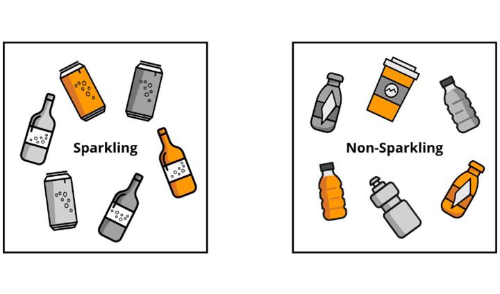
The organizational value of the product list page has several aspects. The first aspect is the fact that you can have multiple product list pages (item categories) for one website. For instance, if you sold beverages, you could have one page for sparkling drinks and one for non-sparkling.
.
PLP Navigation: Filters
The second navigational aspect of the product list page are the filters. You could filter your sparkling beverage page based on any field found on the item record, native or custom. If a field is used for filtering, it is called a facet. For example, container (glass bottle, plastic bottle, or can), flavor (apple, peach, plain, etc), and quantity (12oz, 24oz, 32oz, etc). When the customer adds a filter, that helps him to only see the products he is interested in.
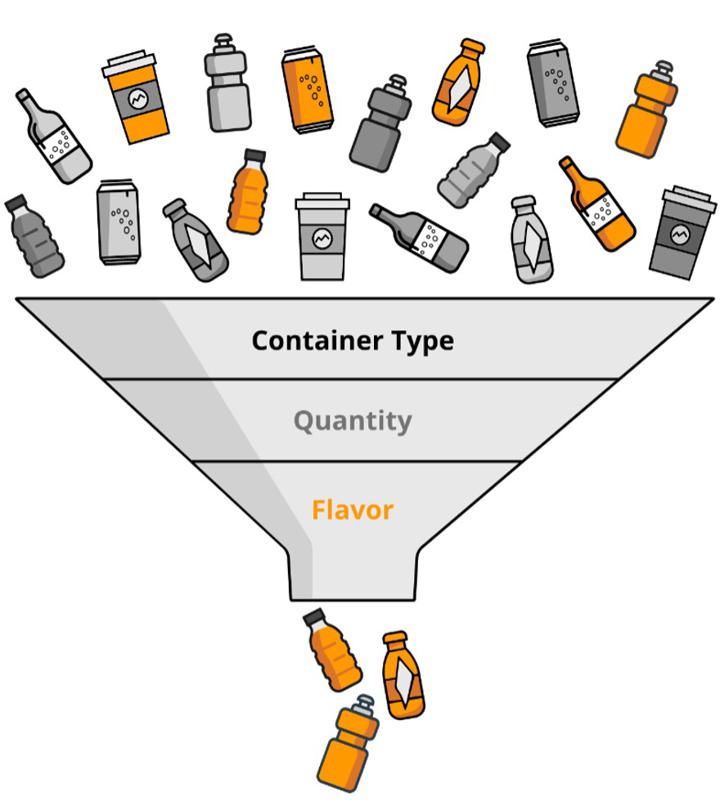
Distinct pages and/or display filters define the navigational flow of your webstore, the path of travel from first getting a view of an item to deciding to add that item to the cart. Striking the right balance here is crucial; you want your customer to receive just the right amount of navigational assistance to quickly and intuitively go where the desired product is, without feeling like it is work to get there. Too much navigational structure makes it feel like work to find the right item, while not enough structure can force the customer to wade through too many items and give up. The attention span of most online shoppers is short, so if you can’t show them what they are looking for right away, they will get frustrated and leave without buying anything.
The influence your PLP can exert on the navigational flow is a topic that we will return to, because that flow is essential to a wildly successful ecommerce business. For now, we turn to that second purpose of the PLP: leading your customers towards specific items.
.
Drawing Attention to Specific Products
Your customers unconsciously rely on you to prioritize which products are worth their time, which products they need; how you set up your product list page allows you to subtly but clearly communicate that priority to your customers. Letting chance or unimportant product characteristics determine the display priority of your products is a huge lost opportunity, a failure to contribute to a conversation your customer is already having with your website, whether you like it or not. Most obviously, the items at the top of the product list page are the ones your customers see first, and the ones they are most likely to purchase. SuiteCommerce manages this by means of sorting. How should you sort? That depends on which items you want to prioritize, which items to which you want your customers to give their attention.
Want more sorting capabilities on your product listing pages? Check out Advanced Compound Sorting for SuiteCommerce!
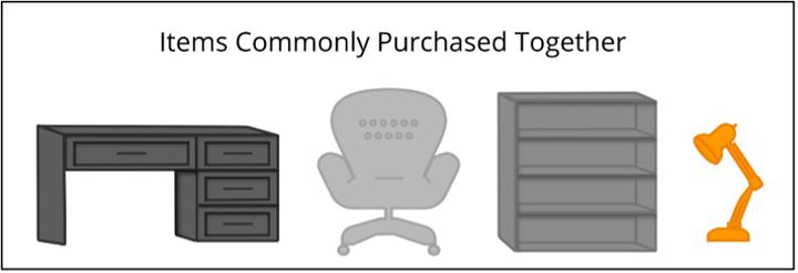
There are several additional ways that you can highlight a product, such as banners, pop-ups, and custom page elements like a “commonly purchased together” box.
Here, too, as with the navigational structure, striking the right balance is key. If you use none of these prioritization tools, it will be as if your side of the seller-customer conversation is silent. If, on the other hand, you use too many pop-ups and banners, it will seem to the customer that you are shouting at them.
.
PLP Display Options
There are multiple display options for the PLP in SuiteCommerce: grid view, list view, and even custom views. For instance, if you are a wholesaler, maybe a spreadsheet view would be most efficient for your customers – remember, you want the process of adding an item to the cart to feel easy, not like hard work:
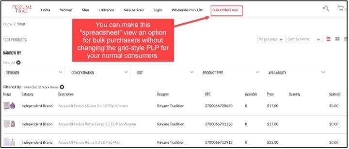
SuiteCommerce is highly dynamic and customizable, but one limitation worth noting is that you cannot natively display any item information on the PLP other than the image, name, and price. However, it is possible to use an extension to display other item fields.
.
Item Images
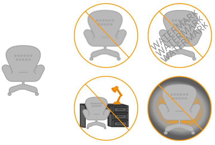
Because you are limited by page real-estate, having high-quality images for display on the PLP is crucial.
.
Not only should you only display high-quality images, but you will also want to consider the framing of those images. Take a look at these two example PLPs:
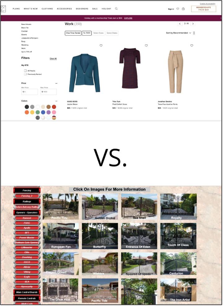
The difference is quite apparent, isn’t it? On the Gates n Fences PLP, the images, although of decent quality, are crowded and hard to sort or search through. In contrast, the Rent the Runway clothing PLP has adequate spacing, intuitive filter options, and strong image-to-background contrast.
One technique you can use to test for overcrowding and these other display factors is to time how long it takes you to count the items on the screen. A similar test for much the same thing is to stare at the PLP while performing a few simple math problems in your head. Then try the same thing with different PLPs from different websites. For some PLPs it will take you significantly longer to count items or do math problems; that means that the page is demanding too much concentration, too much mental processing power. This is bad, because your customers’ brains will tend to ignore pages that are difficult to process. If you are interested in learning more about this brain-overload phenomenon, we can recommend David JP Phillips’ work on what makes for good or bad PowerPoint presentations (for example, check out his TEDx Talk: How to Avoid Death By PowerPoint); most of his points about presentations are equally applicable to ecommerce pages. The main point to take away is that, in general, crowded pages cause your customers to subconsciously lose interest.
Your goal, therefore, should be easy-to-process webpages. Typically, this will mean splitting up your items into multiple pages, instead of trying to cram all of your items onto one PLP. No need to fear; having multiple pages is okay, because these will be well-designed, category-specific PLPs. Not to mention, you have a whole box full of navigational tools for your SuiteCommerce site!
SuiteCommerce Navigation Tools: The Search Bar
The search bar is a key piece of the navigational process for many customers. Often a customer does not have the time or patience to learn the menu structure of your website, and would rather just type in a keyword into the search bar. How you set up the search bar will depend on the type and number of items you sell. These options are easily handled by going to Setup > SuiteCommerce Advanced > Set Up Web Site. In website setup, the Search Index sub tab contains all these settings.
Here is a sample, fairly generic way to setup your search bar. It is possible to reorder the priority of fields, the type of match, etc.

When the customer searches via the search bar, he or she is really searching all of the item records in your backend NetSuite account (or at least those set to display in the webstore). This is one of the massive benefits of using an all-in-one integrated system like NetSuite, because you can set up webstore searches to find just about any field on the item record, without any additional data entry or data upkeep. The website searches are always up to date, because they always reference the data master/source.
To see how this works, imagine that you sell dental products. You could, in your backend NetSuite account, create a custom field on the item record indicating whether or not a toothbrush is designed for children. Now, if you set up your search settings to include this field as a search criteria, and then your customer types “children’s…” into the search bar, the search will return all the items that are marked as designed for children. There, you just had a conversation with your customer analogous to what could happen if that customer had asked a sales associate in a brick and mortar store which toothbrush he should get for his three-year old. That is assuming, of course, that the associate somehow knew the status of every toothbrush on the shelf.
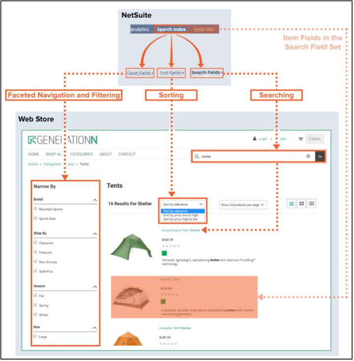
For an overview of the way facets, sorting, and searching influence the PLP, see this infographic from Developers.SuiteCommerce.com:
.
SuiteCommerce Navigation Tools: Menu Bar and Item Categories
NetSuite allows you to organize items via commerce categories. These are groupings of items, groupings that are completely set up in the backend of NetSuite. It is possible to set up subcategories and sub-subcategories for further division, if you have a lot of stacked item types or categories. All of the categories for a single website will be grouped under a single catalog, which is basically a distinct collection of commerce categories. You can maintain multiple catalogs in NetSuite, which can be useful if you had multiple ecommerce websites, perhaps one for B2B customers and one for B2C customers, or one for selling electronics and another for selling furniture.
The navigation bar of your site can be set up such that there is a distinct PLP for each category (or subcategory). As long as these tabs and subtabs don’t become overwhelmingly complicated, this can be a great way to make it easy for customers to quickly navigate to the PLP relevant to their interests.
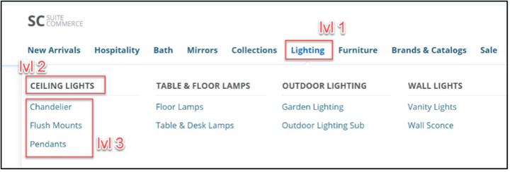
In this example screenshot, Lighting is a level 1 category, under which there are four level 2 categories, each of which is subdivided into several level 3 categories. Hovering over Lighting will reveal the drop-down you see here. Clicking on Lighting will take the user to a categories page, which is sort of like a PLP of PLPs, and would display links for the four level 2 categories.
Because each category-specific PLP serves as a sort of mini homepage, everything we said above about the homepage applies here, too. A quality category cover-image or image carousel (or imbedded video) is well worth the effort.
Subway’s website offers two examples of clearly-defined category PLPs with tasty images:
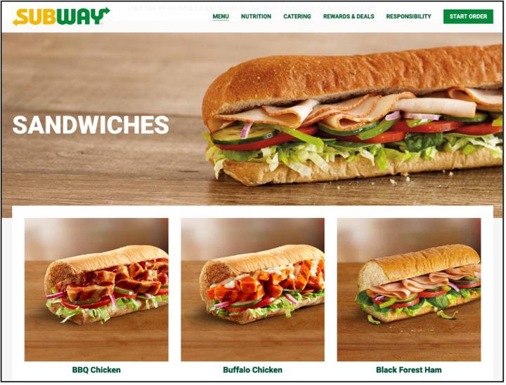
Images from: Subway.com Sandwiches - and - Salads
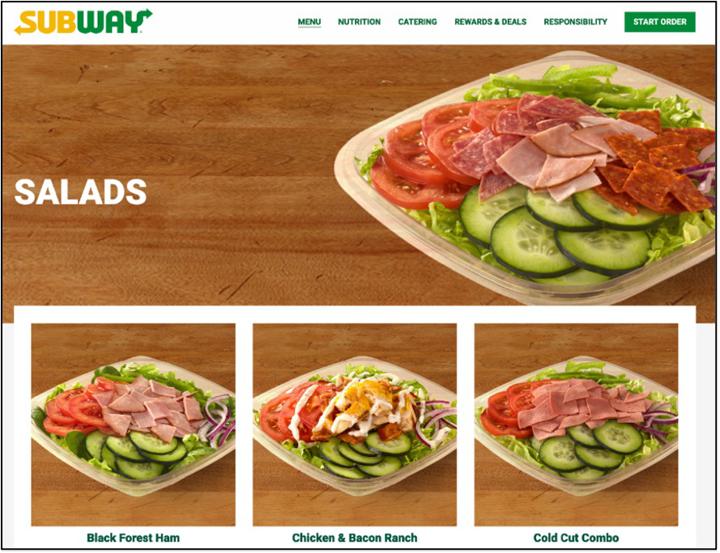
Note the layers of aesthetic continuity. Items on the same PLP are framed and staged very similarly, while items on two different PLPs still have similarities in appearance, but with some variation between the two categories.
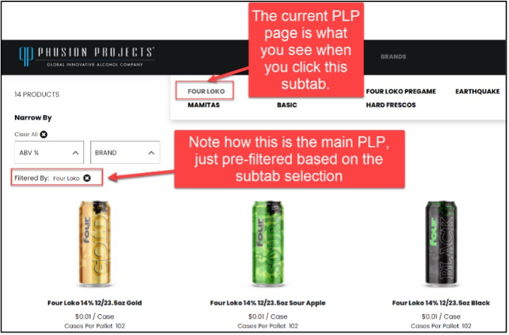
An option worthy of note: If your customers often buy items from multiple commerce categories during each website visit, you may want to consider setting up your navigation subtabs to all link to the one, central PLP, just with different filter options selected depending on which navigation tab is clicked.
Most of our discussions about site navigation have been forwards-oriented. That is, we have been concerned with how a customer is funneled from more general pages to more specific pages, and finally to the checkout. But not every move the customer makes is forward progress; sometimes the best move is backwards, back up the funnel to a more general page. The need for this reversal can arise for several reasons, such as a misstep, the need to buy a second item, or the desire to compare two different items.
The primary feature that SuiteCommerce offers to help your customers with this retrograde motion is breadcrumbs.

Digital breadcrumbs are essentially a visual representation of where you are in the outline of the whole site. They are a more reliable version of Hansel and Gretel’s famous method of marking their way home. Clicking any element of the breadcrumbs takes you to that level of the outline. Breadcrumbs are especially useful when you have good SEO on an individual PDP or PLP, because the specific page might be the first one a visitor to your site lands on. When that happens, breadcrumbs allow the new potential customer to quickly orient himself in your site and seamlessly enter the forward journey towards checkout.
.
Add to Cart Options on Product List Page
Remember that the PLP is primarily a tool to direct your customers along to the next stage in their purchase journey. A key goal for many ecommerce businesses is designing a product list page for higher conversion rates. With SuiteCommerce, there are two ways that you can direct your customers to add an item to their cart straight from the PLP.
1. You can include an Add to Cart button on each item.
2. You can leverage Quick-Add functionality, which allows a customer to view key product details and add the item to their cart, without having to navigate away from the PLP to a detailed PDP.
You can hide the Add to cart button from matrix items that require an item option selection, and leave it on for all other non-matrix items. On the other hand, the Quick Add functionality works well for both standard items, and matrix items.
While some customers may choose to add an item straight to their cart from a PLP page, most won't. In most cases, the next stage in the customer's purchase journey takes place after a customer clicks through from the PLP to a PDP (Product Display Page) for a particular product. You're going to need a slick, informative PDP that makes the customer want to add the item to their cart and continue through the purchase process to place an order. So, if you're ready, let's go take a look at how to build the ideal PDP in SuiteCommerce.
NetSuite Commerce Partner
That's all for now, but we hope this article was helpful and informative! If you have general questions about SuiteCommerce Product List Pages or how you can improve the PLPs on your own SuiteCommerce website, feel free to contact our team at any time. Anchor Group is a certified Oracle NetSuite Commerce Partner equipped to handle all kinds of SuiteCommerce projects, large or small!

We are a premium SuiteCommerce agency that creates powerful customer portals. Unlike our competitors, we have already solved your problems.
FREE SuiteCommerce Book
If you liked this article, you'll LOVE our book on SuiteCommerce! How do we know? Because the content in this article was reproduced from a section of our book! So, what are you waiting for?
Order the free SuiteCommerce book today, and we'll even pay for shipping!
